


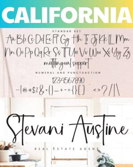
At its core, Advantage strikes an ideal balance. Its forms exude tradition through meticulously crafted looping strokes and a structure echoing the roots of handwriting. Yet an approachable air of ease gives the typeface an endearing friendliness, making its nostalgic qualities feel accessible rather than stuffy. This balance allows Advantage to feel contemporary while retaining heritage appeal beloved by all.
Another secret to Advantage’s broad likability lies in its versatility. The typeface transitions effortlessly between contexts large and small, retaining readability in headlines alongside graceful flow in body text. Its balanced proportions and open counters ensure legibility whether printed or displayed digitally. From invitations to branding, Advantage brings elegance wherever it appears.
Subtle nuances also contribute to Advantage’s charm. Alternate characters introduce variety while ligatures provide fluid connections enhancing readability. Special features feel like extra gifts rather than gratuitous additions. Swashes add a romantic flourish that feels celebratory rather than overwrought. Every detail comes together harmoniously.
Most of all, Advantage feels welcoming – its looping curves invite the viewer in rather than keeping them at arm’s length. The typeface exudes an earnest warmth through its hand-crafted authenticity. It is this engaging yet dignified personality that has kept Advantage in vogue as tastes have come and gone. Its versatility, refinement, and above all welcoming spirit ensure timeless relevance. Advantage proves some classics deserve their enduring popularity.
How to Install Fonts On Windows


Reviews
There are no reviews yet.